VH07V logo RSS
Logo v3
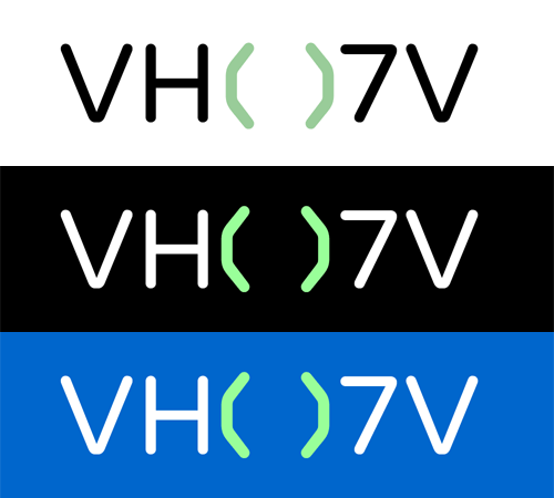

Tried to go in an entirely different direction just to see what I could come up with and I got this.Pretty cool right? It's kinda techy, which is probably why I like it so much. I tried it on different background colors to see how it might look on a T-shirt. What do you think?Although it looks pretty cool (IMO), I'm not sure how mainstream it would be...
Logo v2
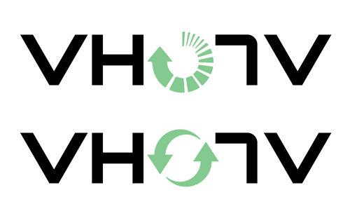

Expanded on a couple of my favorite concepts and came up with the following two. They both utilize the "0" in the logo to communicate the ideas of being perpetual, always refreshing and evolving, etc., in addition to visually showing the need to reverse/flip things around.What do you think?
Font Usage
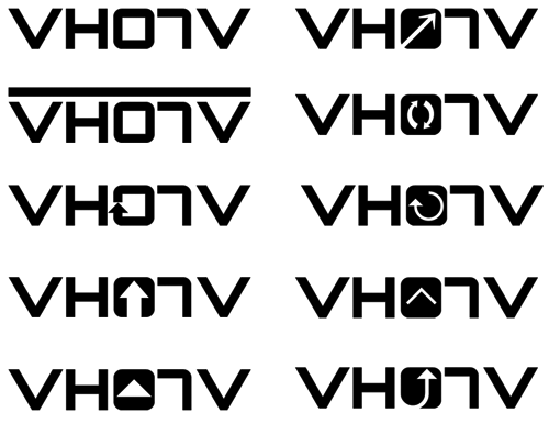

I've been playing with a lot of fonts lately to see which ones would work well (and be strong enough) as a possible logo. I emailed the designer of one of the fonts I really liked, asking him if I could use it and his reply was pretty simple: "Go for it." With that, I did some quick mock ups of some possibilities.Which are your favorites?
Tags
- All
- 2022 Little League World Series
- Best of Small Business Awards
- Chavonnie Ramos
- coronavirus
- covid19
- fundraiser
- Giving Back
- Hawaii
- Hawaii Business Magazine
- hawaii festivals
- hawaiiverse
- hawaiiverse podcast
- home tee
- kamaka dias
- keep it aloha podcast
- Little League World Series
- LLWS
- loves
- loves bakery
- Made in Hawaii
- Made in Hawaii Festival
- media
- omiyage market
- pop-up shop
- store hours
- VH07V logo